Pastel Technique: Grand Canyon of the Yellowstone
- Bob Palmerton

- Aug 6, 2017
- 1 min read
Working on the Grand Canyon of the Yellowstone, a breathtaking vista from photos my world traveler daughter Sara took last year. Here's the reference photo:

First I sketched the scene with light pencil. I moved the waterfall a bit to the right (compared to the photo), to improve the composition and help emphasize this area of focus. Then I applied an acrylic wash representing the main values and colors of the scene, with a bias toward that golden hue that appears to emanate from the rocks. The nice thing about an acrylic underpainting is the speed in which it dries, as well as the opportunity to introduce some bold colors.

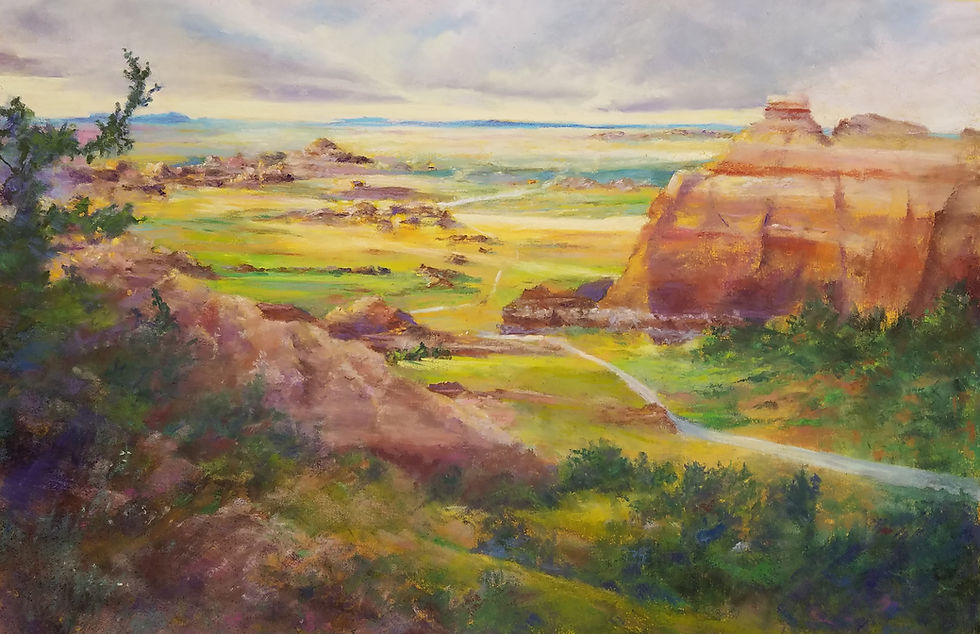
After layering in a simple underpainting wash of pastel and alcohol for the darkest values in the painting, I started filling in the lighter values and began to add some color. The main point of this portion of the work is to lay in the proper values, embellishing the colors later on.

I continued to add value with color as I work around the canvas. I spent some time at the top of the painting working the distant blueish horizon. Note the very subtle evergreen treeline at the top of the distant ridge. I also added a bit of action to the waterfall.

The next step was to add some foliage to the pine trees, then I gave the painting a light spray of fixative. This did not darken the pastel and will allow me to add further layers while keeping the base painting intact.
Here's the current version. Check back soon for the final version!


Comments