StudioSense: Seeing the Lake through the Trees
- Bob Palmerton

- Mar 24, 2018
- 3 min read
Hiking in the Upper Peninsula of Michigan last November, I cam across this varied collection of trees:

Since the photo above is rather bland, I took advantage of modifying the digital image to bring out more color. All of a sudden, a mix of some fascinating tree colors start to emerge. I particularly like the greenish tree in the foreground, and the contrast with the white birch and the large dark tree to the left. There are a couple of those greenish trees in this landscape, begging me to do a little research to find out what is happening to them!
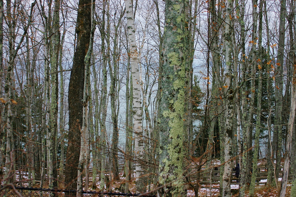
The view faces Lake Superior. You can barely see the greenish color of the lake through the trees on this overcast day. The more I look at this photo, the more I think that I can modify a somewhat ho-hum scene into a vibrant pastel painting.
So what's the plan? To ask my usual questions, what is it about this landscape that I want to convey in a unique and absorbing painting? Here are my thoughts:
- Bring out the bold color of those three main trees while de-emphasizing the grays of most of the other trees.
- There is a fascinating horizontal and diagonal criss-cross against the vertical trees that I want to emphasize. Those include the wood fence (I will omit the metal fence in the foreground), and the tree that has fallen with its reddish branches pointing to the left.
- The blue green of the lake will create a wonderful contrast to the grays of the trees.
- The orange leaves will contrast nicely with the blue green of the lake, sky and the distant snow.
- There's a wedge-shaped piece of deep blue sky to highlight
- I'll plan to give the trees "character." Make them dance, reach for each other, point, hug, etc.
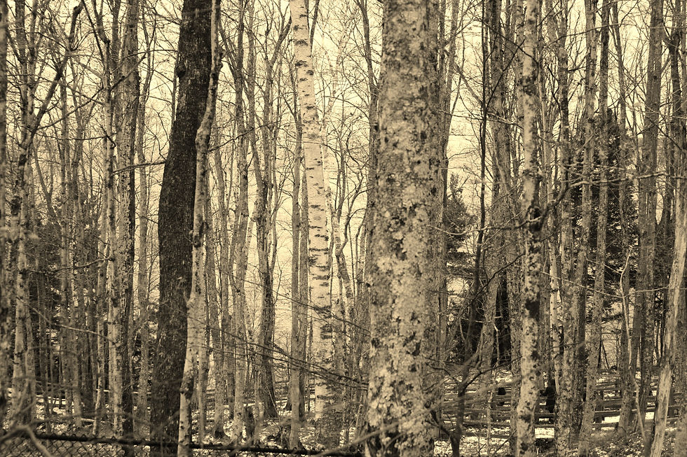
- There is also an interesting "V" shape of the back lighting in this scene. You can pick that out more clearly in the photo below, which has been modified with a sepia tone:
Note the "V" or funnel image of the brightest sky bordered by the trees and evergreens on the right and left. Hint: you may need to quint to see the funnel.
Landscape painting involves how one interprets the landscape, how you can see so much more than what appears on the surface. It is these observations that enable the artist to convey something truly special about an otherwise commonplace scene. This photo, in fact, is rather complicated. No simple focal point or object of interest such as a person, structure, boat, etc. The challenge will be to "draw out" certain qualities that themselves become the focus.
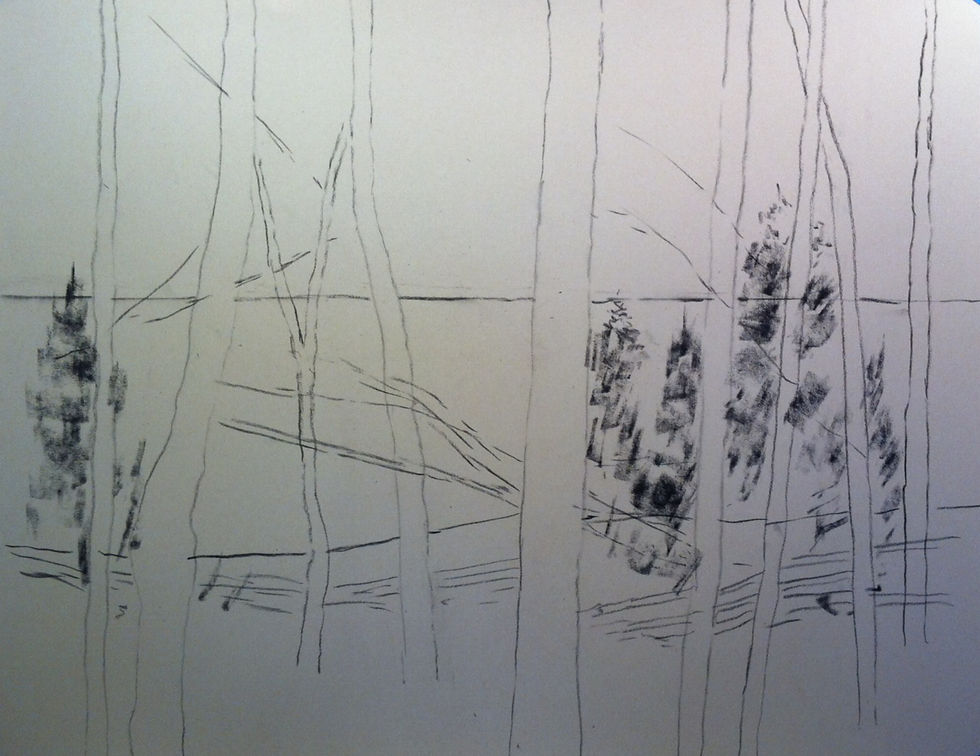
I decided to make this a large pastel painting, 21x27, using a full shee of Uart sanded paper, 400 grade. The sketch below identifies the horizon where the sky meets the water, about 2/3 from the bottom, and the horizon where the ground meets the water about the lower third. The horizontal items are added roughly: the fence and the fallen tree; they will help to break up the overpowering vertical masses of trees.
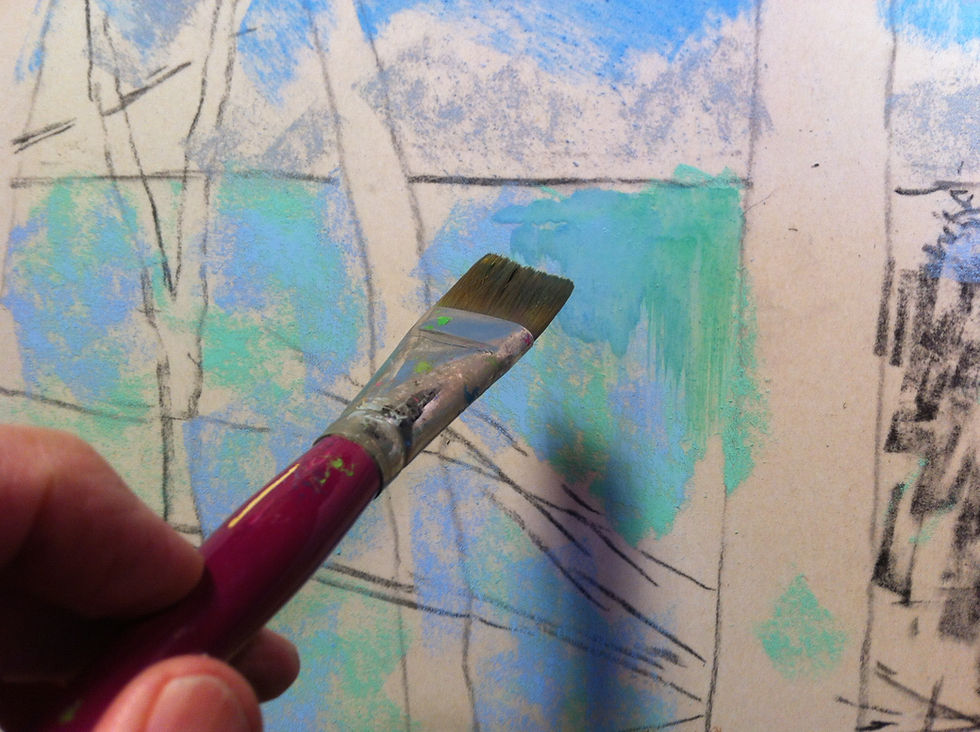
I added the basic colors of the scene. Kind of looks like a first grader's painting.

Then I applied a wash of alcohol with a bristle brush to fill in the surface of the paper. The fine brush and alcohol helped create interesting "runs" of the color. The Uart surface handles wet applications of pastel very well. It dries within 10 minutes.
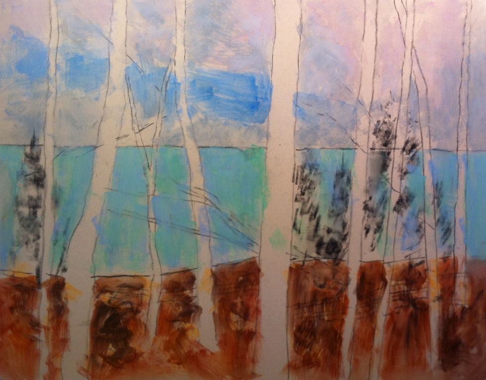
After spreading the basic colors of pastel, I let the painting dry then returned to begin adding pastel to the painting.
I thought about how I can build an intriguing composition by using color and value, instead of relying on the positioning and shapes of the trees. Take advantage of the complementary colors as well as varied light patterns to build harmony in the scene.
Here's the current version, with some go-forward comments below as I continue to refine the painting:

I plan to vary the values of the trees from top to bottom so that they both contrast with the background as well as fade. The contrast will also reverse: with the same tree, I will show "dark tree to light background" and "light tree to dark background." Why bother? With compositional nuances like this, the viewer is engaged with the painting, spending time contemplating the variety of artistic impacts.
Call me a tree hugger I guess. More to come on this painting!


Comments