StudioSense: Green and Red and Blue and Orange
- Bob Palmerton

- Feb 14, 2019
- 3 min read
I was rather pleased with the bold color effects of "The Clearing," where I applied an acrylic under-painting of colors representing the complements (or opposites) of the colors in the final painting (you can see the blog post here). I therefore decided to do a larger work depicting a lovely river scene in Great Smoky Mountain National Park. Here is the reference photo I dug up (clipped to my pastel paper backing):

An observer of this photo will conclude that color was rather "wanting" in this scene, as the rocks all appear neutral and washed out by the sunlight. However, close-up studies of these rocks in the Smoky's reveal a fair amount of iron and other colorful minerals, hence the pastelist's opportunity to exercise artist's license! You can see a variety of reference photos below that will lend subject matter to this pastel painting (check out the orange rocks on the upper left):

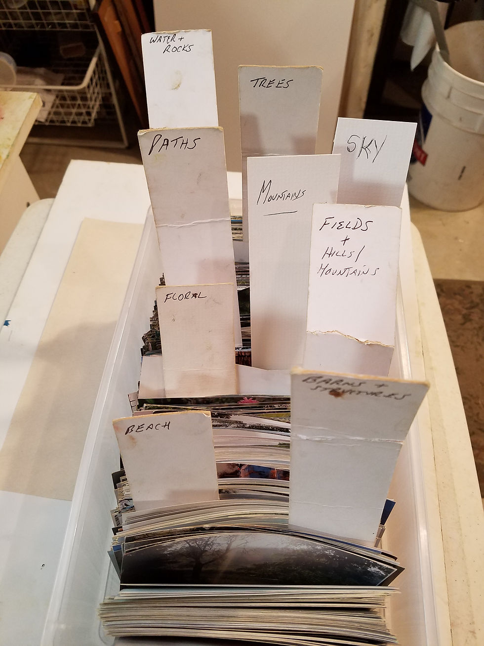
By the way, if you have ever taken one of my pastel classes, you may recognize this collection of reference photos. Today most of my work is digital, so I won't need to thumb through so many photos for ideas:

I decided to turn the reference photo into a horizontal perspective rather than the vertical format of the print. Here is a sketch (the horizontal view) created with pastel pencil:

To bring out the bold orange rocks and the deep green foliage, I set up an experiment. I took my watercolors and tested green and orange pastels against various under-painted colors to see where I could obtain the greatest bold impacts.
Here is the collection of watercolor swatches and pastel strokes I developed, which helped me decide the intensity of the under-painting associated with the pastel sticks I would use in the painting.

My first goal was to decide which under-painting works best with a few difference values of orange (for those iron rocks). I chose a deep blue, bottom row, third from left. Note the second stroke of orange is quite vibrant. My next choice was the purple swatch to its left.
A quick tip: certain colors in the under-painting will cause a pastel to appear darker that its actual value. See below, where a rather mid-value blue pastel stick looks dark (see the bottom row dash of blue) on this yellow base. The pastel lines above it was a much brighter value of blue.

I digressed and tested a few values of blue pastel on various backgrounds. Here is what I found (see below). As expected, orange (blue's complement) worked best (the swatch on the far right), followed by deep yellow. That black on the left was a test of various colors. I like the green and the orange contrasts. A dark-shaded area (i.e. deep blue) will help to intensify green foliage. Uart has come out with a black pastel paper which I plan to try at some point.

As for the green foliage, once again bold red wins! Bottom row, second from right, in the image below. Runner up is top row, second from left. In sum, I found deep blue, red and purple as my chosen under-painting colors.

I prefer acrylic as it dries bolder than watercolor. Here is the sketch and under-painting applied to the pastel paper. Pretty wild. It was fun to paint!

I find that the paper is not as wet when applying acrylic versus watercolor (even though the acrylic needs to be wet to apply properly). Next, I let the pastel paper dry, turned it upside down on a sheet of plastic wrap and covered with heavy art books to ensure that it would be flat and ready to receive pastel during the next morning's session.
Here is the final version of "Early Spring on Abrams Creek."


Comments