Tempest at Grand Teton
- Bob Palmerton

- Nov 6, 2021
- 4 min read
Tempest at Grand Teton is a tribute to the spectacular scenery of Grand Teton National Park, as well as homage to the mysteries of nature and the shock and awe that can emerge when one is wandering off in the wilderness. This original pastel painting is 16x12 done on Uart sanded pastel paper, with a variety of pastel brands.

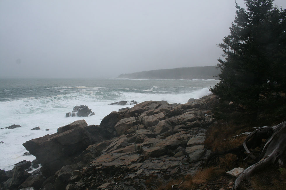
The pastel was conceived from a reference photo (below) that my Daughter Sara took while hiking in the park. Notice the ominous sky, contrasting with the sharp peaks of the mountains. The darkness of the photo presented a challenge to the artist to convey the true landscape.

In the enhanced photo (below), I saturated the colors and increased the brightness, using this version of the scene as the subject of the painting.

Upon starting any pastel, I would complete a simple sketch with initial notes. I determined that I would start the painting with an under painting of acrylic paint. I chose deep purple (Alizarin Crimson and Ultramarine Blue with a bit of black). My notes also reference the need to keep the values low in the foreground, to help enhance the bright highlights in the mountains. The large tree on the right in the photo was replaced with smaller greenery and some "angry" sky.

Here is the acrylic under painting. Note the lighter values used for the snowy portion of the mountains and the light portion of the sky.

While modifying a painting, I maintain a list of adjustments to make. After each day's work, I photograph the painting and observe it at various times of the day and night, adding to my list of enhancements (I use Google Tasks which I can update from my computer or smartphone). See below my list for this painting:
Tempest at Grand Teton (notes):
Snow squall mid to upper right
Bring squall over edge of mountain
Sharp sun highlights on some edges
Sharp mountains overwhelm lower landscape
Reduce foreground mass
Mid-right muted tree line
Curve pines up from lower left
Darken lower left triangular area
Darken value all lower left
Darken lower left of hill away from sun
Darken all values of lower third
More light spots in trees mid right
Log at bottom
Reds in pines
Strong highlights in mountain to contrast with dark
Pink Glow
Pink in sky
Fog and snow mid right right
Darker clouds to bring out bright highlights
Fix lower mid left
Soften snow fields
Review 3D paint version
Some sharp points lower half
Bit more grey in hill mid left
Fix spot left of mountain peak
More dark value left pines
Item Number 22, "Review 3D paint version," refers to a digital modification of the painting-in-progress that I completed in the Microsoft 3D Paint application. I will often upload a photo of the painting and have it sit on my computer (while working) and make adjustments using various degrees of opacity and thickness (I use the watercolor brush feature of the software). This activity allows me to experiment before heading the the studio the next morning. It also keeps me amused during a dull Zoom meeting!
In the version of the painting below, I completed the initial, less angry version of the sky (my first job to tackle), and began to block in the sharp, rocky cliffs.

There are several features to mention regarding composition, color and values in this painting. Here is the final version once again:
Composition
As for the compositional elements in Tempest, I have created an opposing structure of angles between the mountain range and the foreground. Note that the mountains diagonally fall from the left to the right, while the foreground including the pine trees falls from right to the left. This creates balance between these two large masses in the painting.
The pines move along the same diagonal structure right to left, but also begin to shift upward, directing one's vision toward the mountains.
The one odd feature of the composition is the fallen tree in the foreground. Placement in the start of the foreground can distract the view and make the viewer's eyes get "stuck" at that part of the painting. The purpose of adding this feature (which is also in the reference photo) is to "calm down" all of the diagonals going on in the painting: the mountains, foreground, pine trees and the clouds are all slanting one way or the other, and the horizontal tree adds balance and harmony to the entire scene.
Color
The deep blues and dark purples and magenta help express the foreboding atmosphere and contrast with the more uplifting and inviting brightness of the snow-capped peaks. Contrast of hue is used with the redness behind the deep green pines, as well as the mountain blue against the ochre-orange mid-ground. As I wrap up a painting, I tend to experiment with color surprises, but I held off as best I could in this case, adding only a little bit of pink highlights on select spots on the mountains.
Value
It was critically important to tone down the values in the foreground in order to build emphasis and direct the viewer to the mountains and the sky. Lightening up the foreground values and the pine trees would have correspondingly reduced the awe of the mountains and sky. Much of the foreground is not detailed, with just hints of color and shapes. Much of it is just a dark mess.
Completing "Tempest at Grand Teton" was a satisfying end to a busy work week. Immersing myself into the activity of painting, while listening to Vivaldi, Wagner, Verdi, and a host of classic rock tunes, makes my early morning studio time one of the best parts of my day!
Tempest at Grand Teton is available here in our shop.


Comments